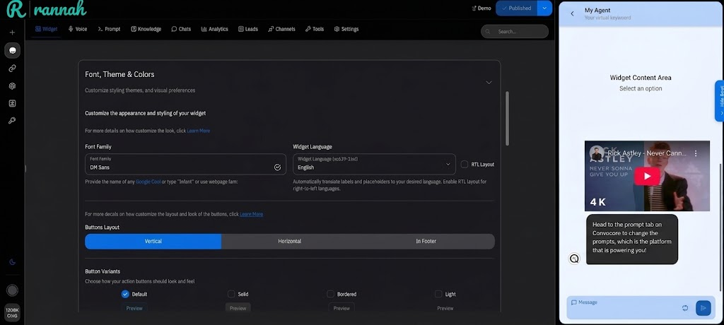
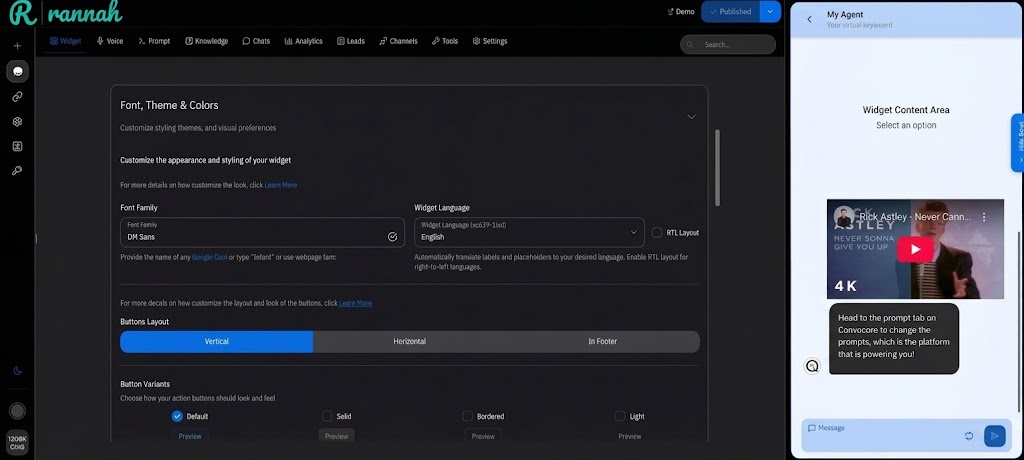
Create a visually stunning widget that perfectly matches your brand identity. The Theme Customization feature provides powerful tools to control every aspect of your widget’s appearance, from colors and fonts to layouts and images.
Why Customize Your Theme?
Brand Consistency Ensure your widget seamlessly integrates with your website’s design language and brand guidelines
Professional Appeal Stand out with a polished, custom-designed interface that builds trust and credibility
User Experience Create an intuitive, visually pleasing experience that encourages user engagement
Competitive Edge Differentiate your business with a unique, memorable widget design
Quick Start Guide
Access Theme Settings
Navigate to your agent dashboard and click Theme in the left sidebar
Choose Your Approach
Select between Preset Themes for quick setup or Custom Theme for full control
Configure Visual Elements
Set up fonts, colors, images, and layout preferences
Preview & Fine-tune
Use the live preview to test your design across different scenarios
Start with a preset theme close to your brand colors, then customize specific elements for the perfect match!
Theme Configuration Options Visual Styling
Image Assets
Color Themes
Font Family Configuration
Popular Professional Fonts:
Google Sans Flex - Modern, clean (default)Inter - Highly readable, tech-focusedPoppins - Friendly, approachableRoboto - Google’s flagship, versatile Avoid “inherit” unless you’re certain your website font loads properly in the widget context
Automatic Translation
50+ supported languages
Auto-translates labels and placeholders
Maintains context and meaning
Right-to-left (RTL) support
Custom Translations
Override auto-translations
Brand-specific terminology
Cultural adaptations
Regional dialects
Launch Avatar Purpose : The main icon users see before opening your widgetSpecifications :
Size: 64x64px minimum
Format: PNG, JPG, WebP
Max size: 0.5MB
Best Practices :
Use your logo or brand icon
Ensure good visibility at small sizes
Consider contrast with your website background
Header Image Purpose : Top banner in your widget headerSpecifications :
Aspect ratio: 16:9 or 3:1
Format: PNG, JPG, WebP
Max size: 0.5MB
Best Practices :
Brand logos or hero graphics
Keep text minimal (may not be readable)
Optimize for both light and dark themes
Banner Image Purpose : Full-width promotional or branding imageSpecifications :
Width: 600px minimum
Format: PNG, JPG, WebP
Max size: 0.5MB
Use Cases :
Product showcases
Promotional banners
Brand storytelling
Chat Avatar Purpose : Icon representing your AI agent in conversationsSpecifications :
Size: 40x40px minimum
Format: PNG, JPG, WebP
Max size: 0.5MB
Design Tips :
Professional headshot or mascot
Friendly, approachable appearance
Consistent with brand personality
Background Chat Image Configuration
Background Image Options • Light textures • Geometric patterns • Brand watermarks • Busy, distracting images • High contrast backgrounds • Text-heavy graphics
Visibility Controls
Completely Visible : Background shows fullySubtle Overlay : Semi-transparent for readabilityHidden : No background image
Image Management
Reset to Default : Use platform defaultCustom Upload : Your own imageRemove : Clean, minimal background Preset Themes
Custom Color Palette
Blue Professional, trustworthy, corporate
Purple Creative, innovative, tech-forward
Cyan Fresh, modern, healthcare/wellness
Pink Friendly, approachable, lifestyle
Yellow Energetic, optimistic, food/travel
Red Bold, urgent, e-commerce/sales
Dark Mode Benefits:
Reduced eye strain in low-light environments
Modern, sophisticated appearance
Better battery life on OLED devices
Popular with tech-savvy users
Test your images and text contrast carefully in dark mode to ensure readability
Auto-Generation
Choose your primary brand color
System generates 9 complementary shades
Ensures proper contrast ratios
Maintains accessibility standards
Manual Control
Customize each color shade individually
Fine-tune for specific brand guidelines
Advanced color theory application
Perfect brand color matching
Color Psychology & Brand Alignment
• Trust and reliability • Professional services • Technology and innovation • Healthcare and wellness • Energy and excitement • Food and hospitality • Retail and e-commerce • Creative industries Advanced Customization Features
Time-based Themes
Automatic light/dark switching
Business hours adaptations
Seasonal theme changes
Event-based styling
User Preferences
Remember user’s theme choice
Respect system preferences
Accessibility accommodations
Custom user overrides
Responsive Design Optimization
Mobile Considerations
Desktop Optimization
Mobile-First Design Principles 🔄 Vertical layouts work better on mobile screens 👆 Touch-friendly buttons with adequate spacing 📱 Readable fonts at minimum 14px size 🎯 High contrast for outdoor visibility ⚡ Fast loading optimized images Desktop Enhancement Features 🖱️ Hover effects for interactive elements ⌨️ Keyboard navigation support 📏 Larger layouts utilizing screen space 🎨 Rich graphics and detailed images ⚡ Advanced animations and transitions Theme Best Practices
Visual Hierarchy Color Usage:
Primary: 60% (backgrounds, main areas)
Secondary: 30% (buttons, highlights)
Accent: 10% (calls-to-action, emphasis)
Typography Scale:
Headers: 18-24px
Body text: 14-16px
Small text: 12-14px
Accessibility Standards WCAG Compliance:
Color contrast ratio ≥ 4.5:1
Focus indicators for navigation
Alternative text for images
Keyboard accessibility
Testing Tools:
Color contrast analyzers
Screen reader compatibility
Voice navigation support
Performance Optimization Image Optimization:
WebP format when possible
Compress without quality loss
Responsive image sizing
Lazy loading implementation
Font & Animation Efficiency:
Use system fonts when appropriate
Optimize animation performance
Maintenance Strategy Regular Updates:
Seasonal theme refreshes
Brand guideline alignment
User feedback incorporation
A/B testing insights
Documentation:
Brand color specifications
Asset version control
Style guide maintenance
Troubleshooting & Common Issues
Colors Not Appearing
Contrast Issues
Verify Color Format
Ensure colors are in valid HEX format (#RRGGBB)
Check Theme Application
Confirm custom theme is selected and saved
Clear Browser Cache
Force refresh to see latest changes
Test Across Browsers
Verify appearance in different browsers
Quick Contrast Check:
Light text on dark: ratio ≥ 4.5:1
Dark text on light: ratio ≥ 4.5:1
Interactive elements: ratio ≥ 3:1
Tools : WebAIM Contrast Checker, Colour Contrast Analyser
Common Image Issues & Solutions:
Not loading : Check file size (≤0.5MB) and format (PNG/JPG/WebP)Poor quality : Use high-resolution source imagesSlow loading : Compress images using tools like TinyPNGWrong dimensions : Resize to recommended specifications
Images hosted on external servers may have CORS restrictions. Use the built-in upload feature for reliable delivery.
Pro Tip : Always test your theme changes in incognito/private browsing mode to see the true user experience without cached styles.
What’s Next?
Tabs Configuration Create interactive multi-tab experiences that complement your custom theme
Widget Configuration Configure advanced widget behaviors and interactive features
Analytics & Testing Monitor user engagement and A/B test different theme variations
Voice Integration Add voice capabilities that match your theme’s professional appearance